Bank Of Upper Canada 1850 Penny
BUC-223
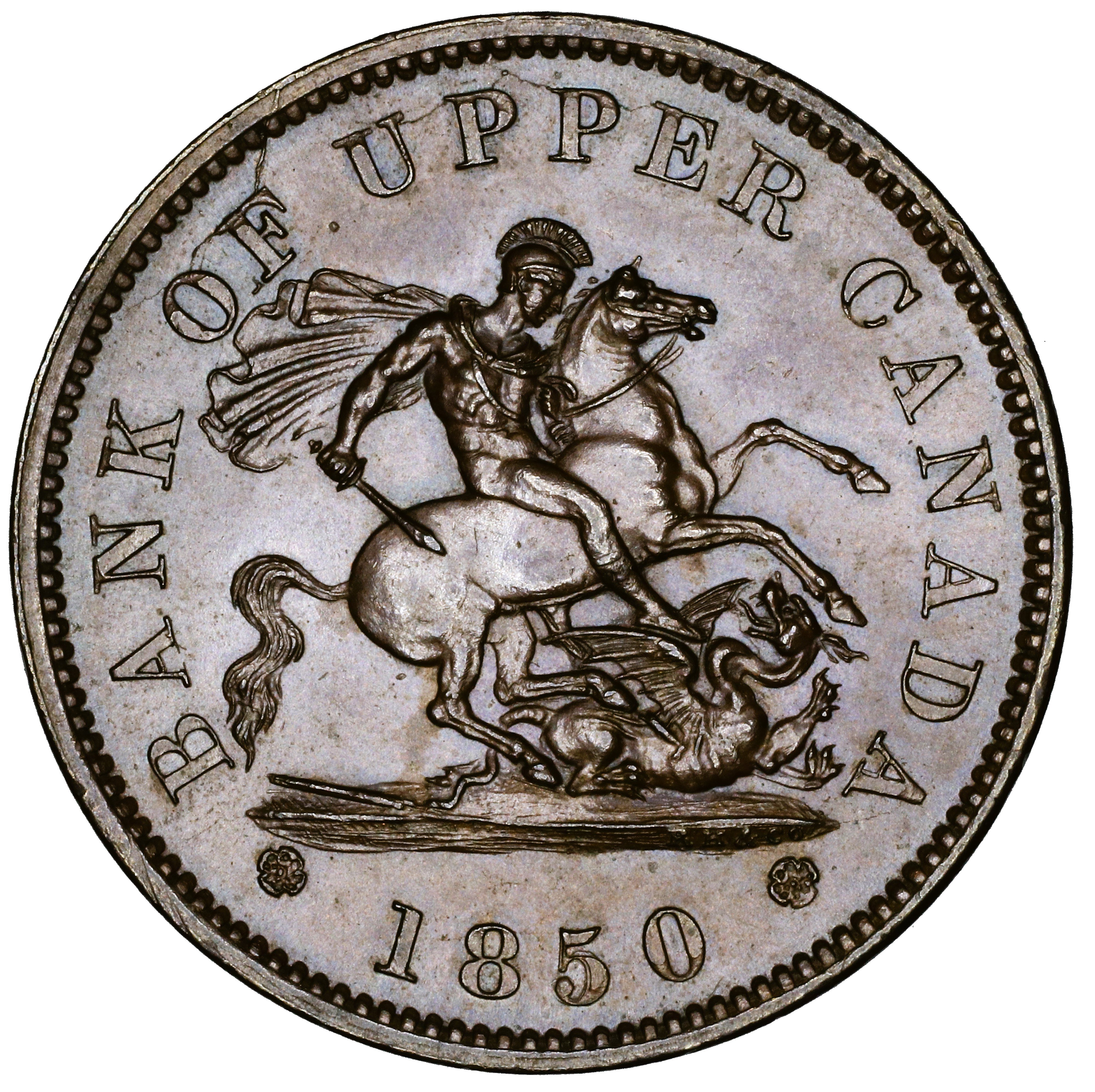
Courteau R10
B. Die Pair-Specific Comments
Two die pairs, BUC-222 and BUC-223, share the obverse die O222, which has a die-defining triple punching of the 1850. This facilitates quickly zeroing in on identifying these two die pairs.
C. Obverse Die Details
1. Obverse O222 Die Cracks and Die State Progression
Summary: BANK OF UPPER CANADA * 1850 *
Red = area with die crack(s) observed in most advanced die pair state
Die Pair State Progression
Abbreviations: Cr = crack, T = trace, S = small, M = moderate, L = large
| Die Pair State | Obverse Characteristics |
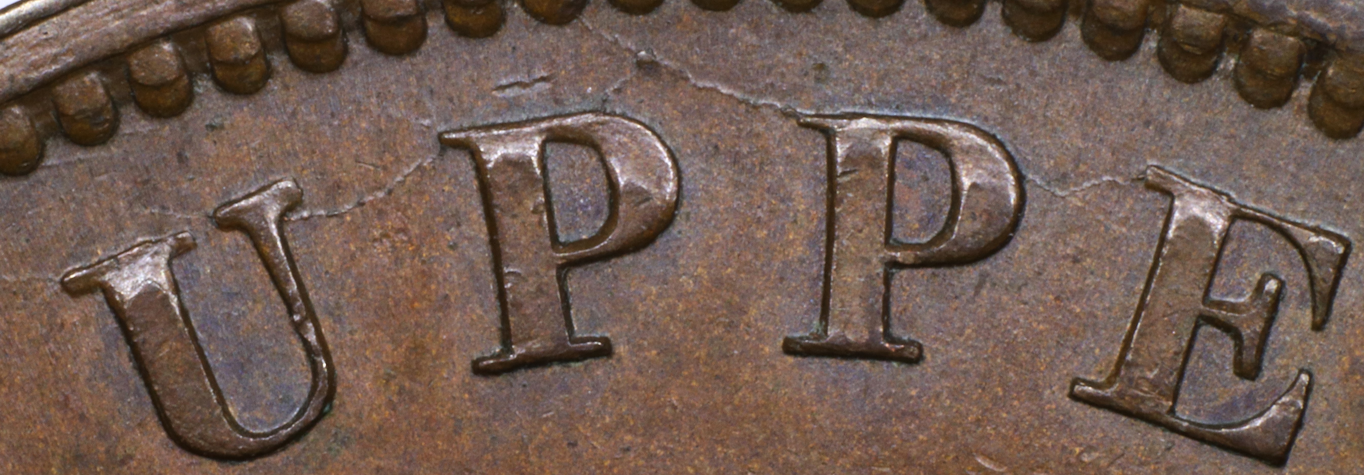
| 223.1 | Cr OF (M), U (T), UP (S), intersecting with cr to PE (T), with a tiny cud at the intersection; R, extending to C (T); CANADA (T); left ground tip to edge (T); right ground tip to CANADA (T) |
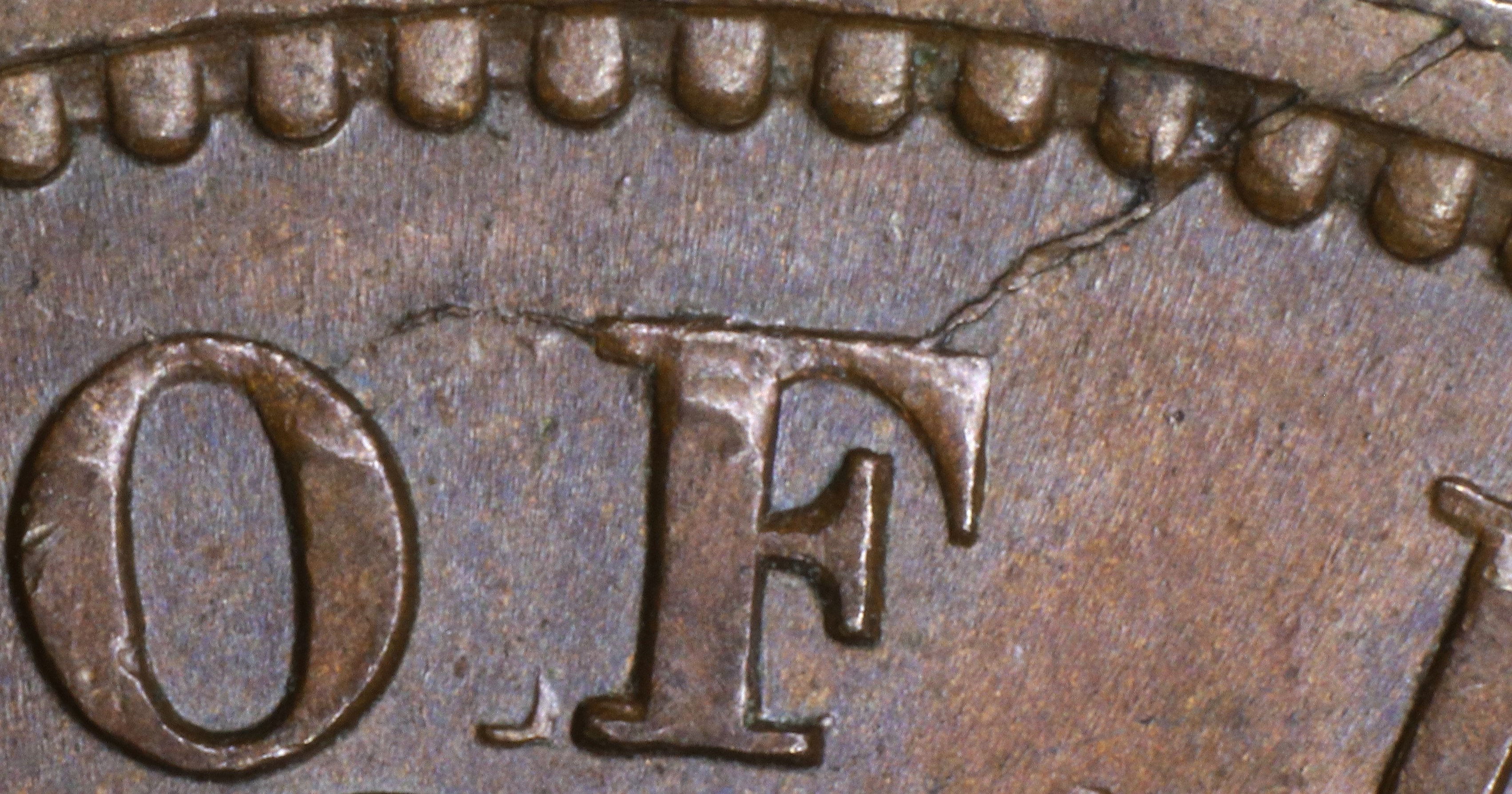
OF (state 223.1) |
UPPER, UPPER & UPPER (state 223.1) |
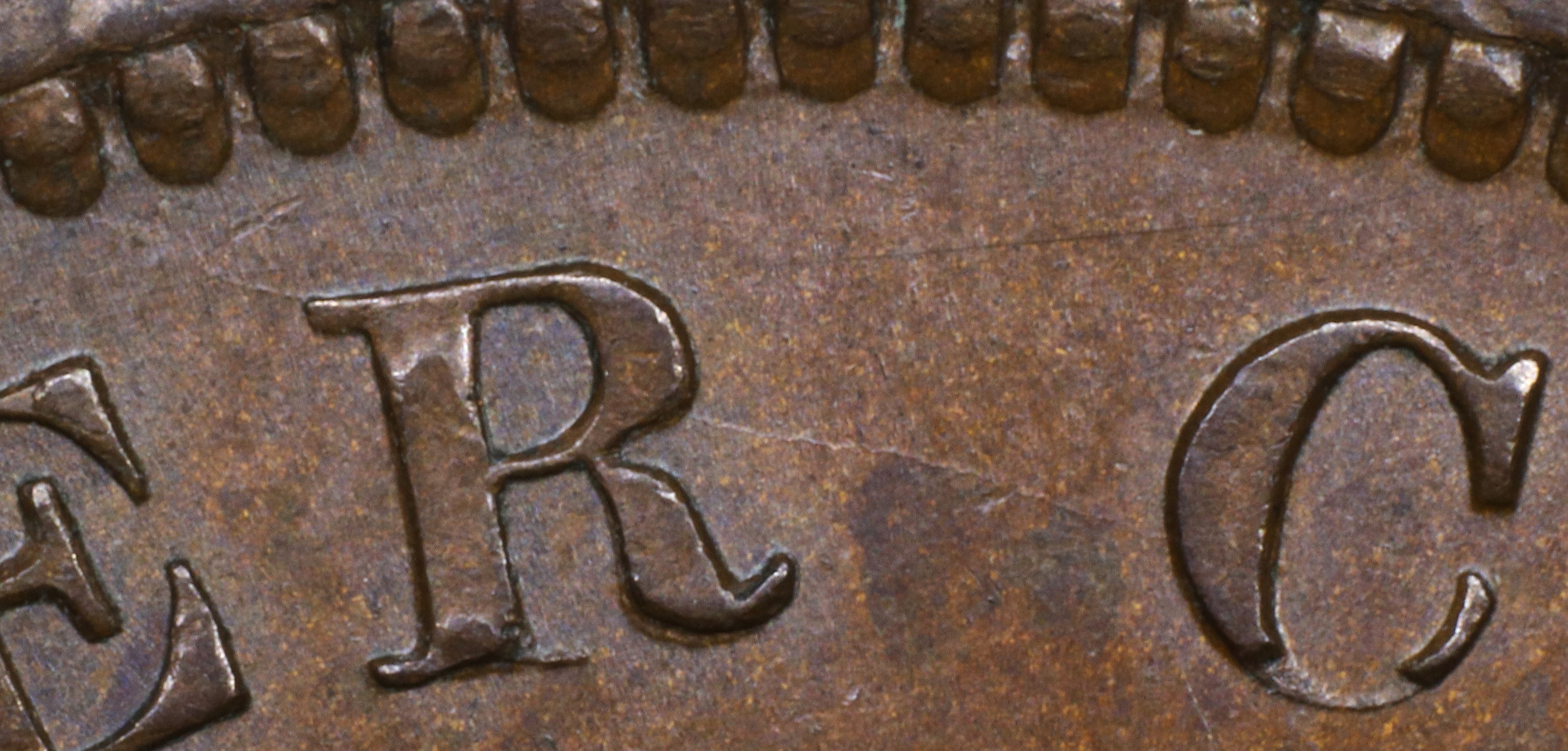
UPPER—C (state 223.1) |
CANADA top to edge (state 223.1) |
Left ground tip to edge (state 223.1) |
Right ground tip to CANADA (state 223.1) |
2. Obverse O222 Broken Letters Unrepaired or Repunched
Summary: BANK OF UPPER CANADA * 1850 *
Letter color code: Black = normal, Green = broken & unrepaired, Brown = broken with noteworthy repunching
BANK |
UPPER |
UPPER |
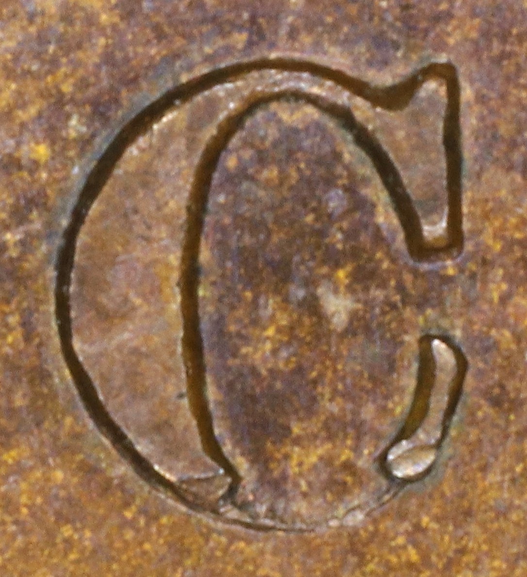
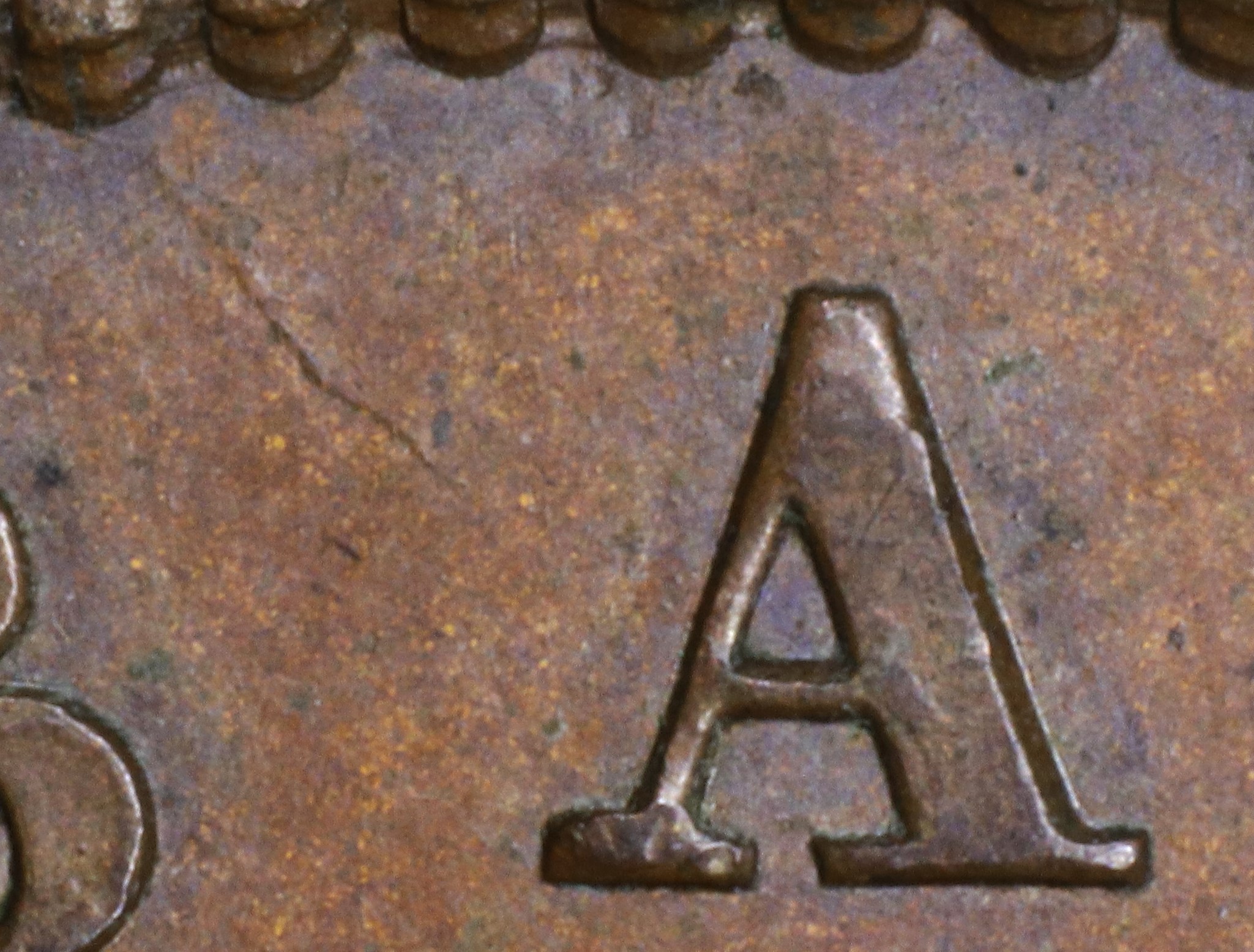
CANADA |
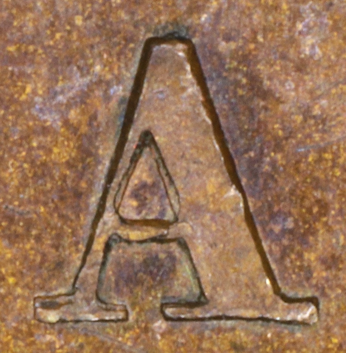
CANADA |
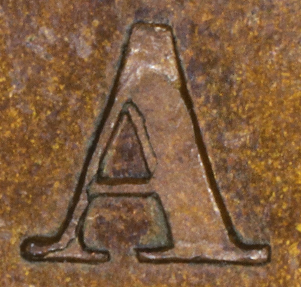
CANADA |
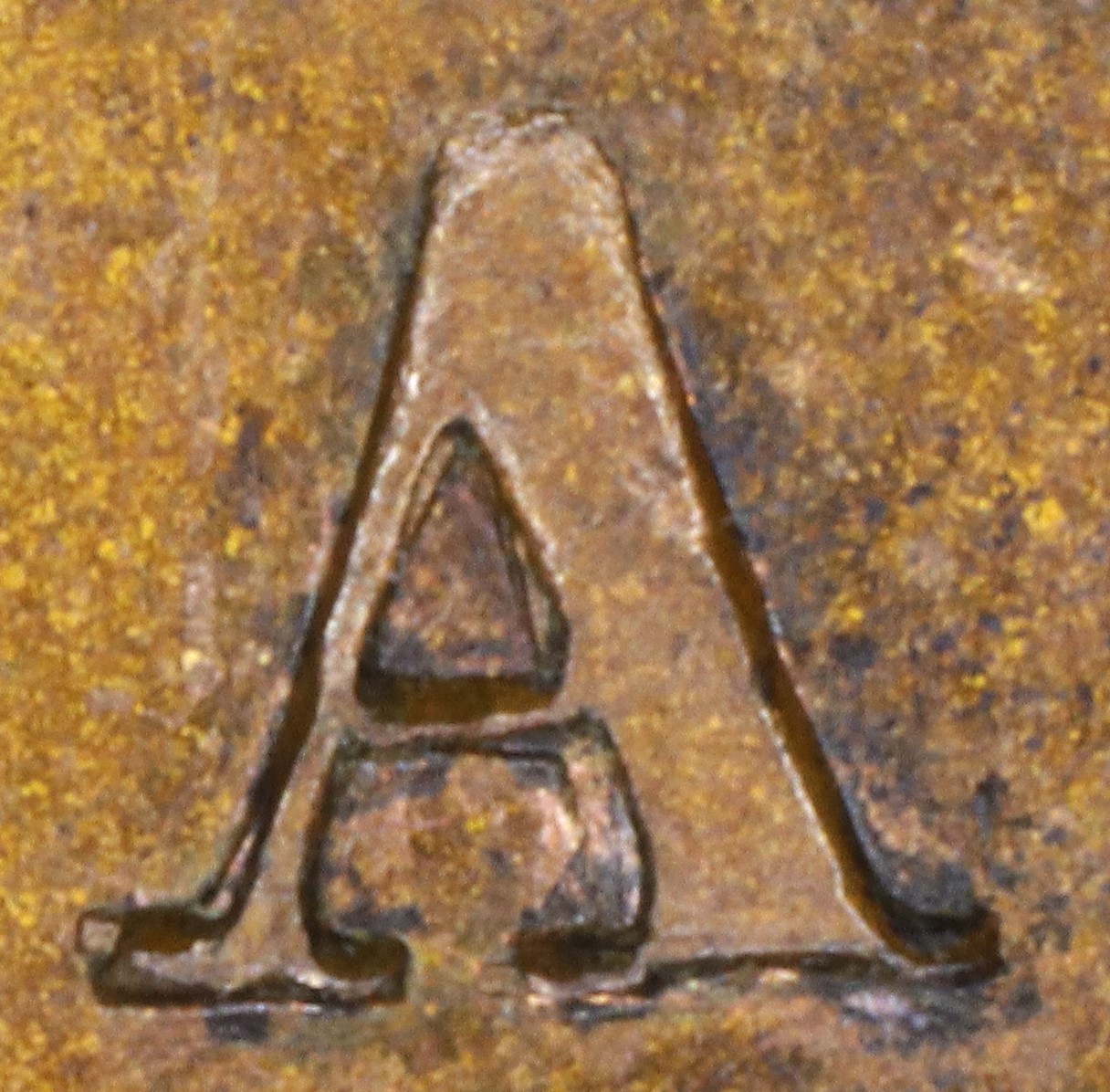
CANADA |
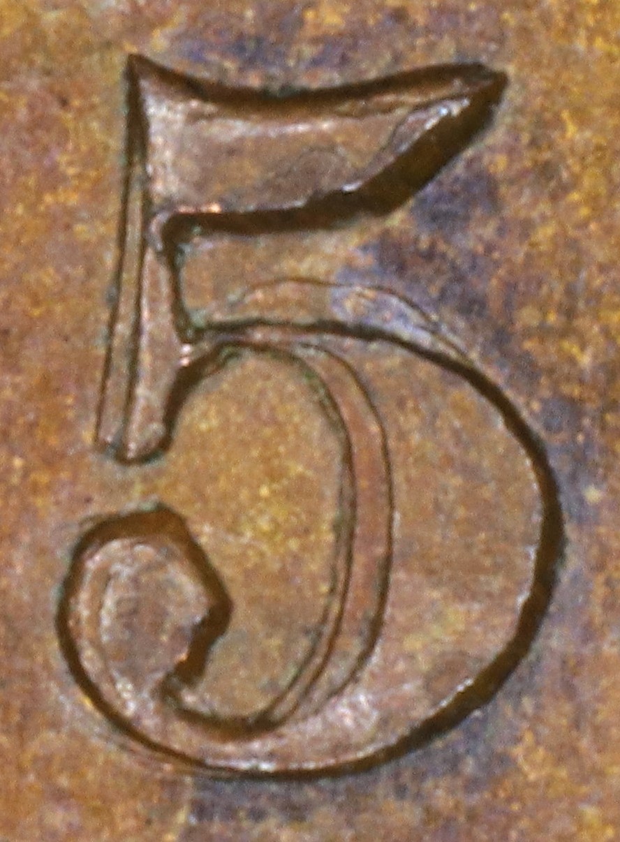
1850 |
Special Comments:
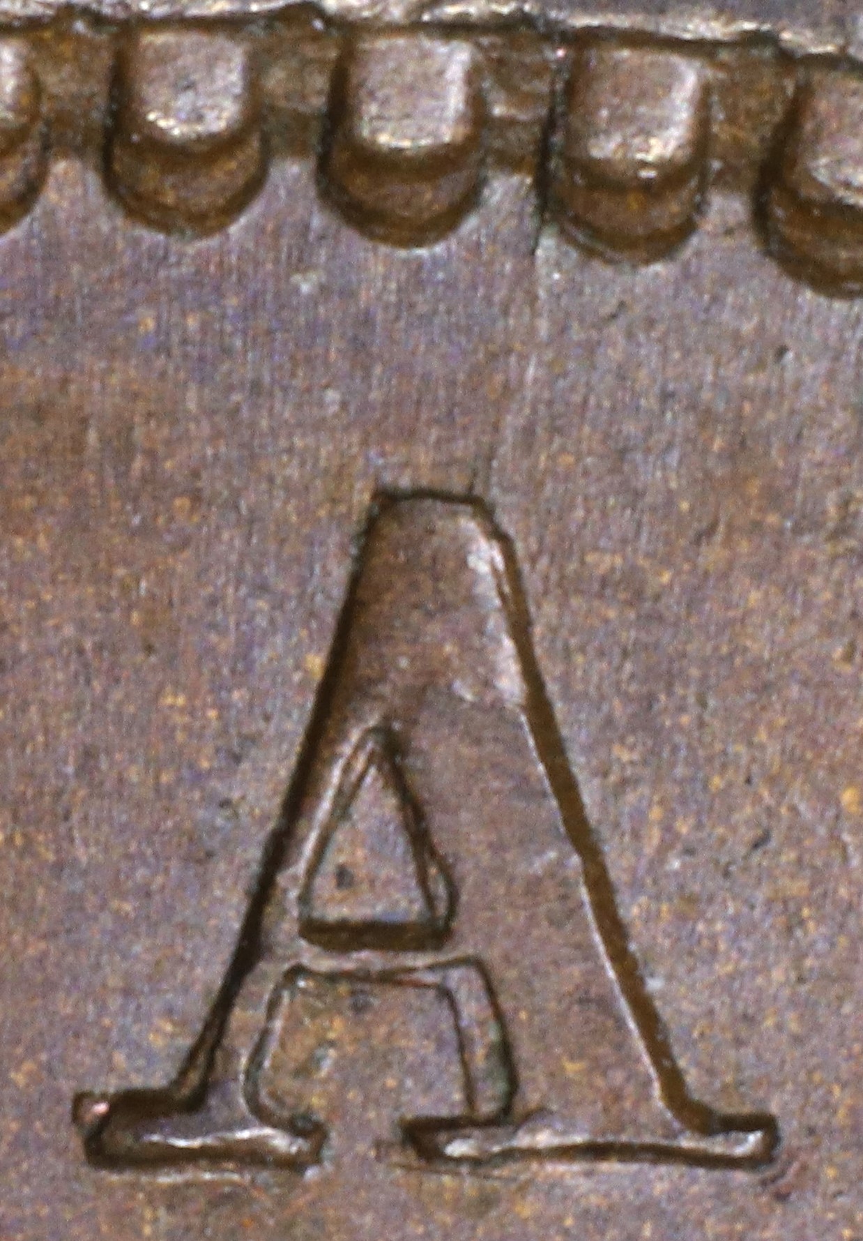
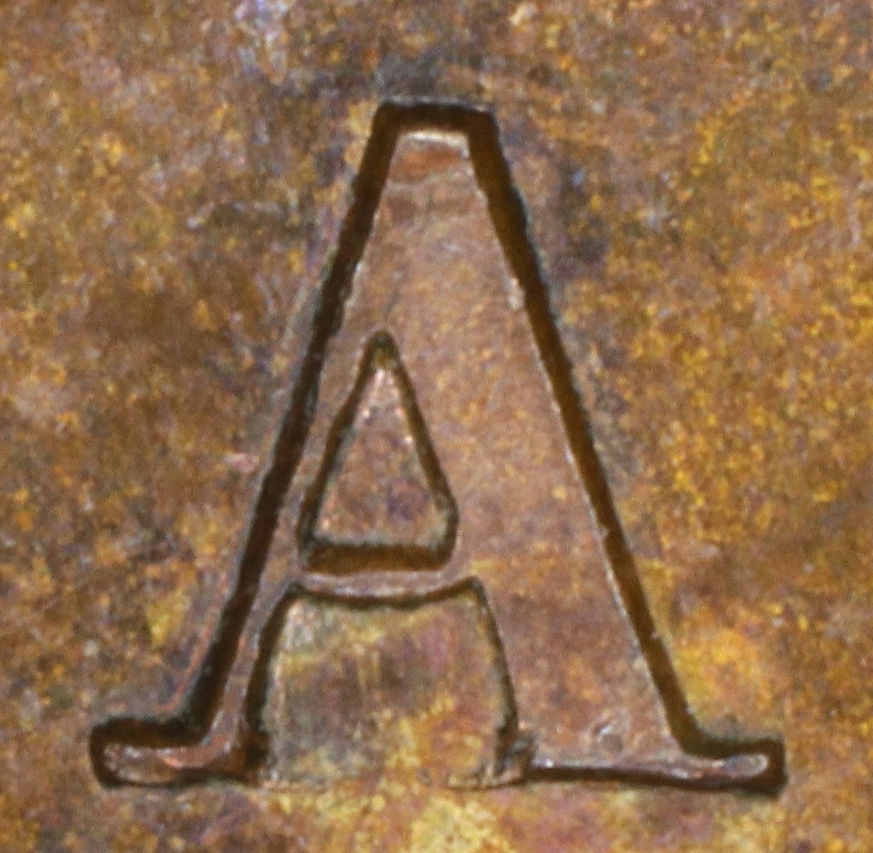
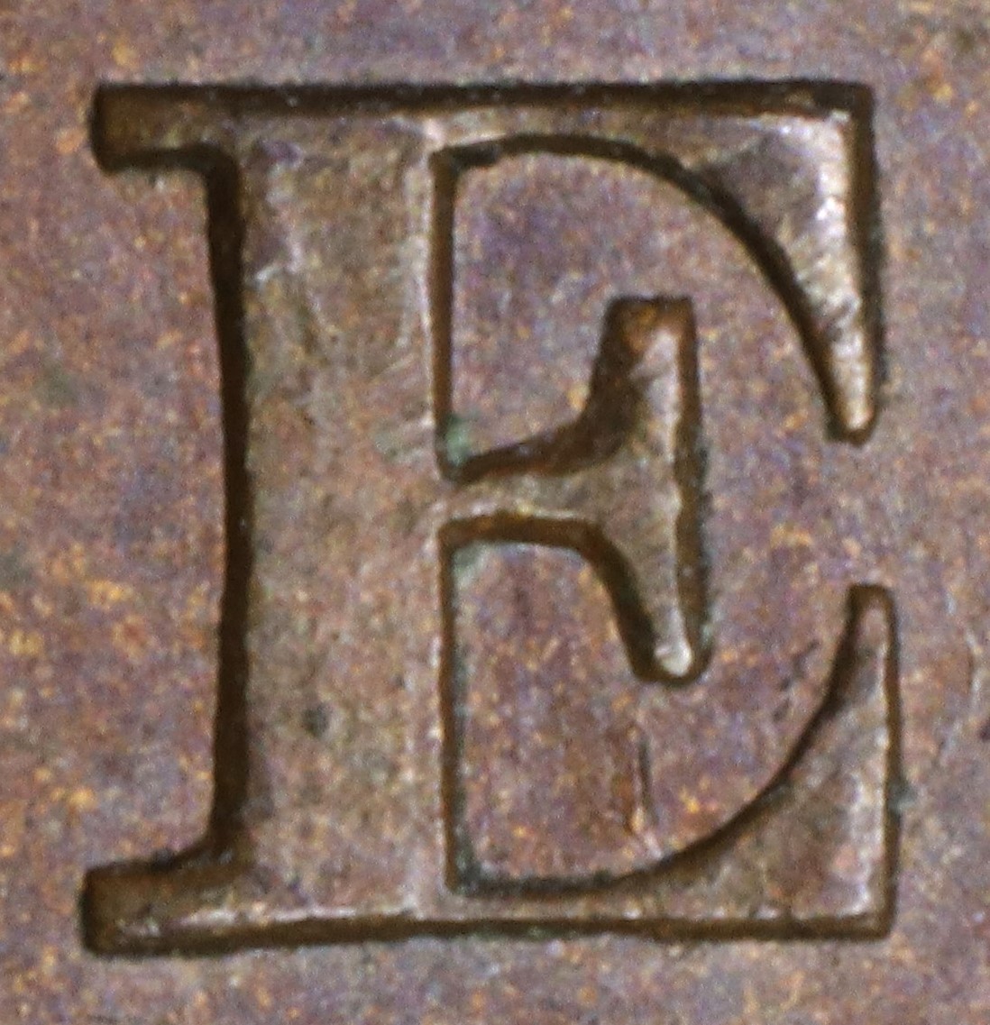
In CANADA the A has been repunched in lower relief over the original faulty letter. Because of the difference in relief both left and right upright sides in the central triangle in the A show clear doubling.
In CANADA the A has been repunched in lower relief over the original faulty letter. Because of the difference in relief the right upright side in the central triangle shows clear doubling and the broken bottom of the original foot of the left leg shows.
In CANADA the A has been repunched in low relief and slightly tilted compared to the original faulty letter. This causes doubling at the lower outside left of the left leg and all along the left side of the right leg.
In the date the 1850 is triple punched.
3. Obverse O222 Die Clashes, Gouges, and Misc. Features
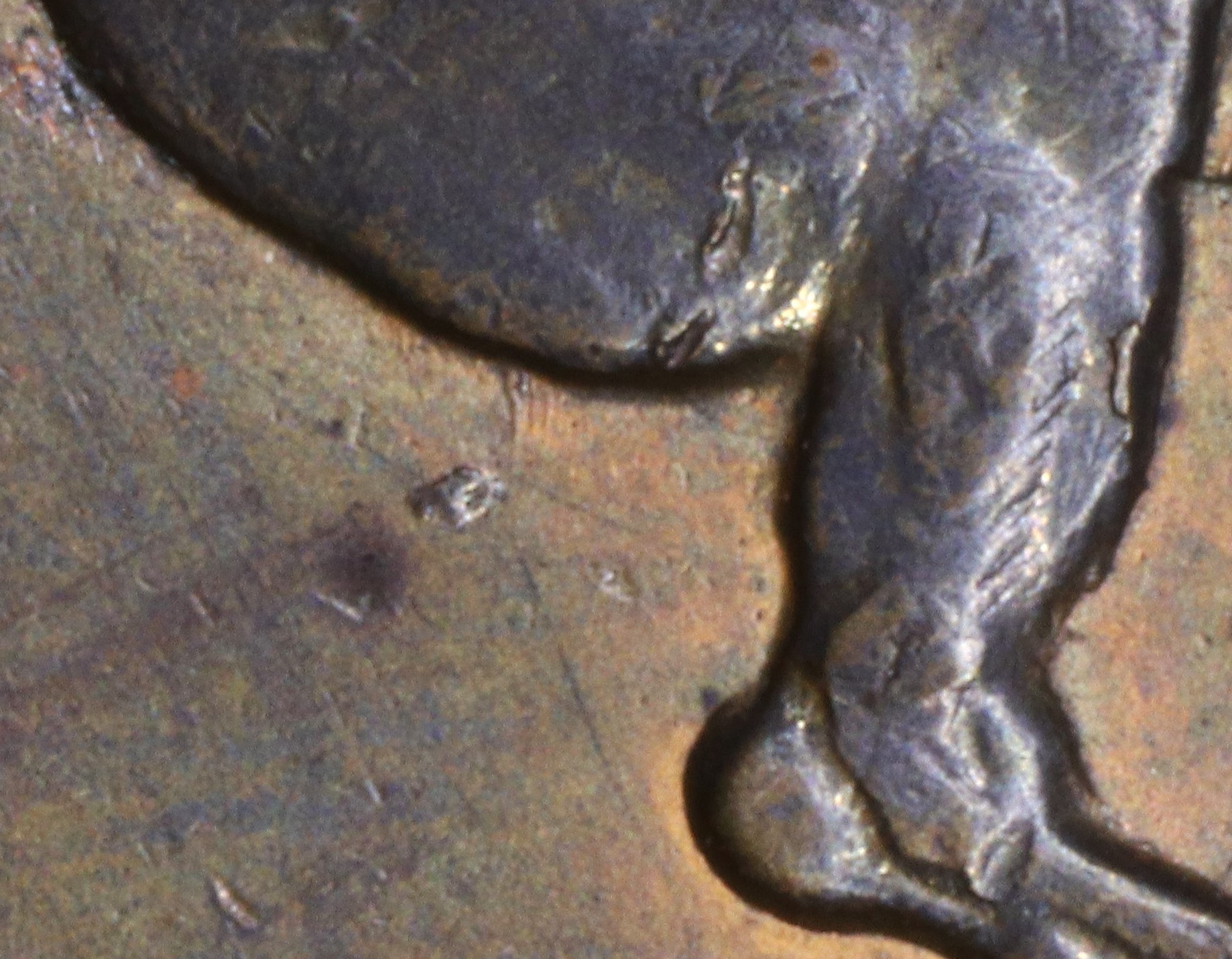
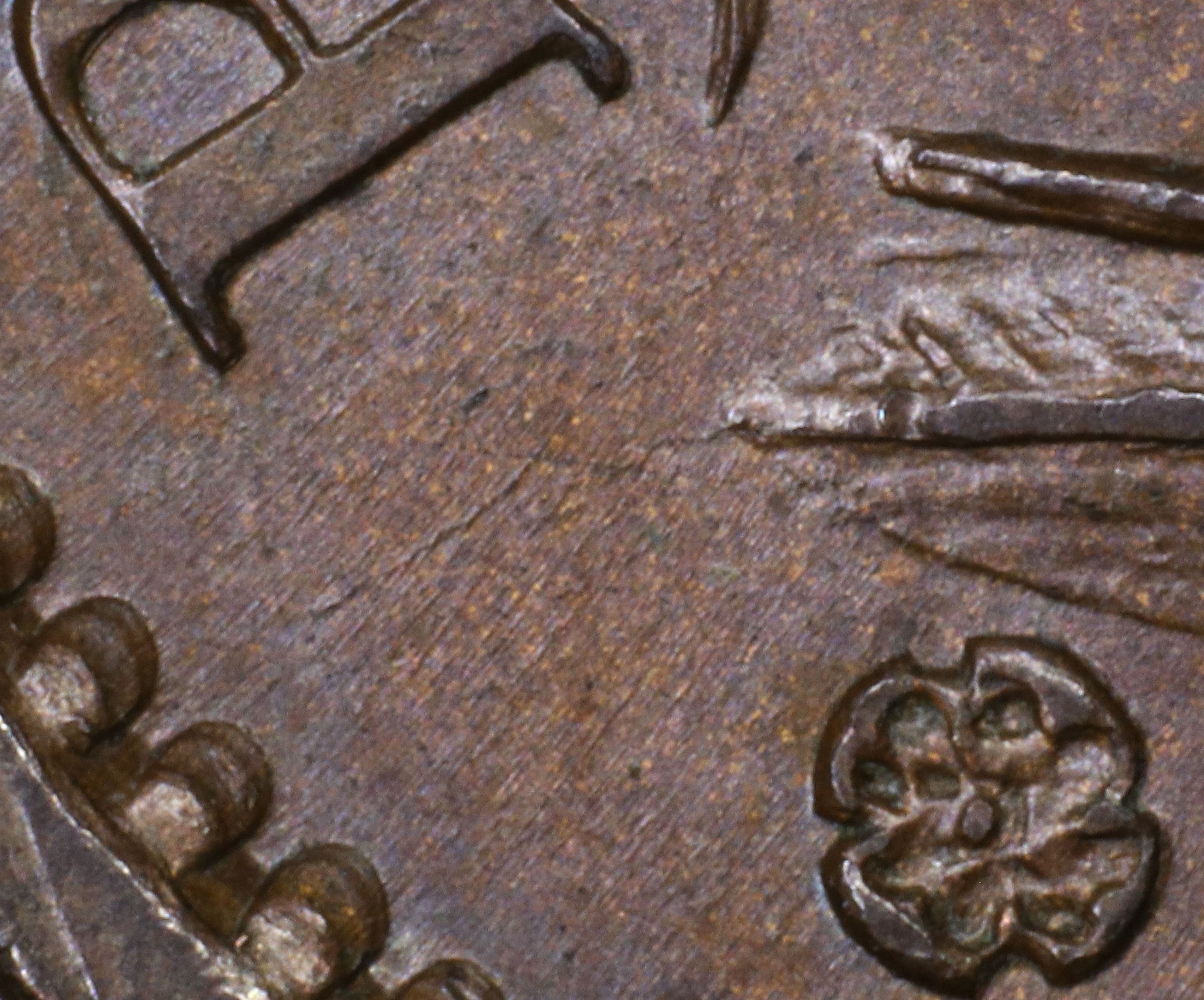
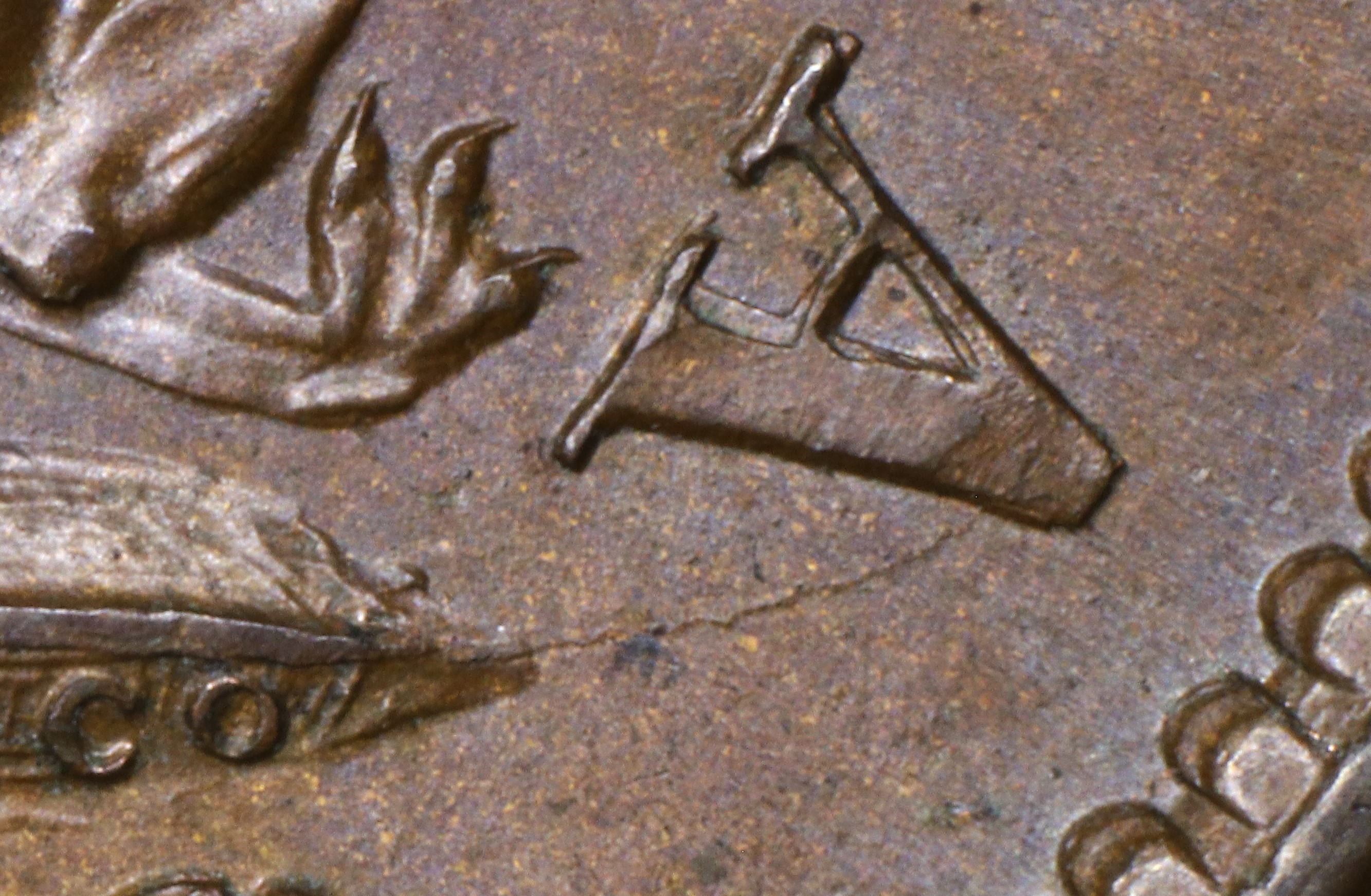
Rust mark below horse's tail |
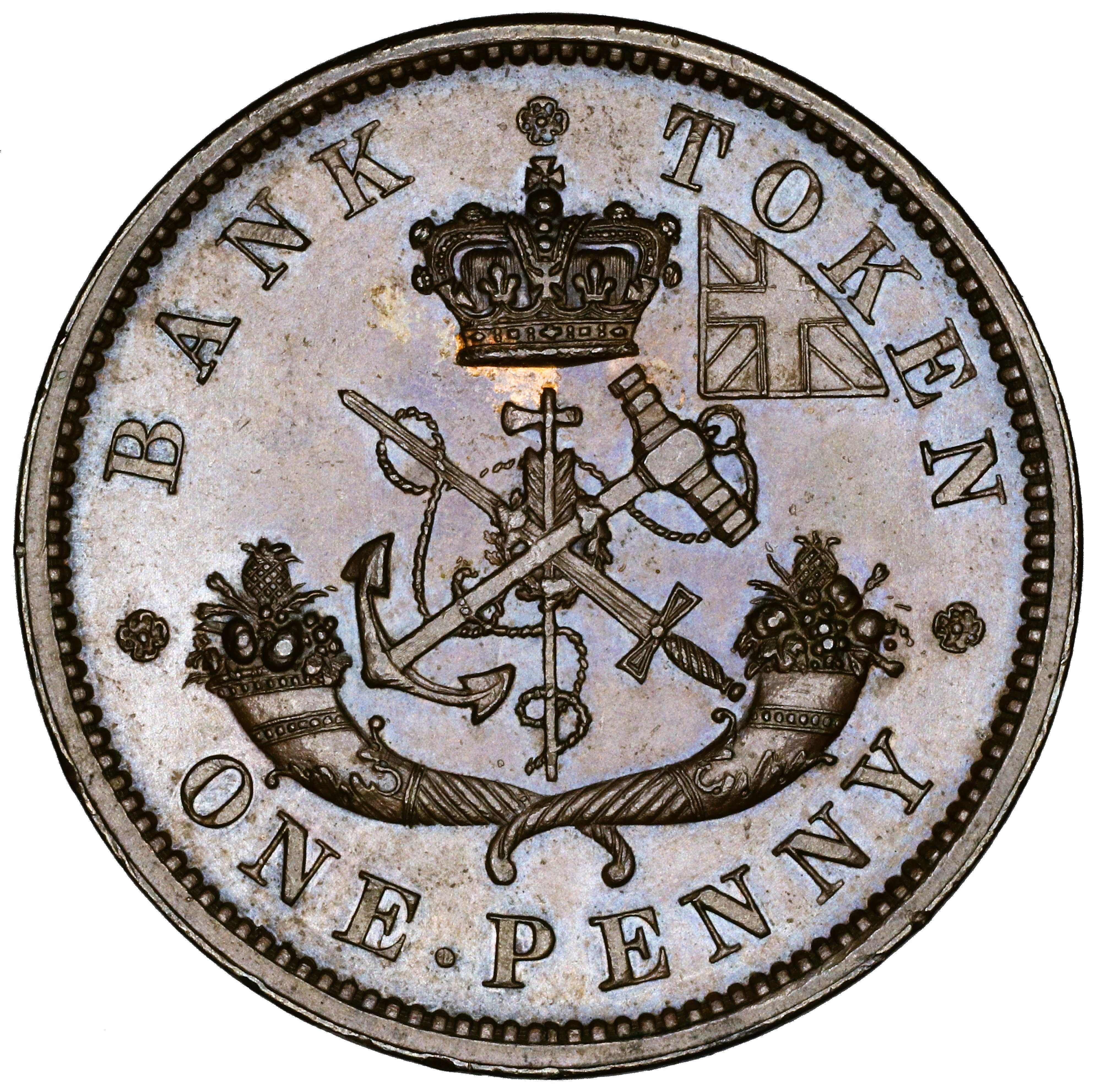
D. Reverse Die Details
1. Reverse R223 Die Cracks and Die State Progression
Summary: BANK Crn TOKEN * ONE.PENNY *
Red = area with die crack(s) observed in most advanced die pair state
Die Pair State Progression
Abbreviations: Cr = crack, T = trace, S = small, M = moderate, L = large
| Die Pair State | Reverse Characteristics |
| 223.1 | Cr to BANK (T) |
BANK |
Special Comments:
None.
2. Reverse R223 broken Letter Unrepaired or Repunched
Summary: BANK Crn TOKEN ONE PENNY
Letter color code: Black = normal, Green = broken & unrepaired, Brown = broken with noteworthy repunching
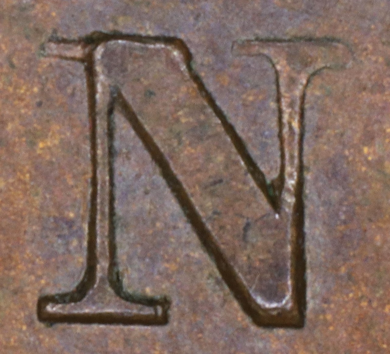
BANK |
TOKEN |
TOKEN |
Special Comments:
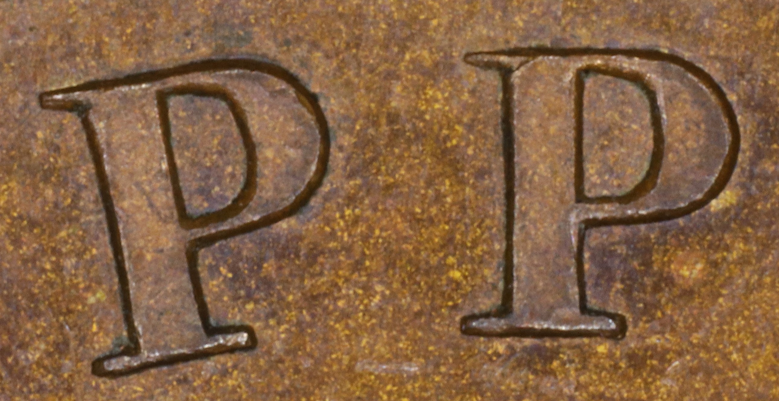
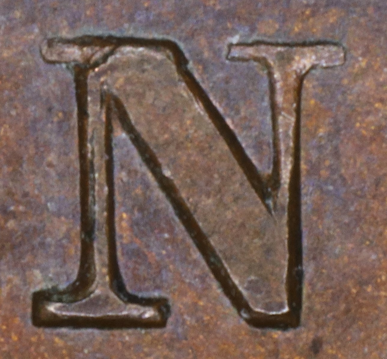
In BANK the N is repunched in lower relief over the original faulty letter. The upper left serif and right leg top thin serif of the new font show, where those features were missing on the original letter.
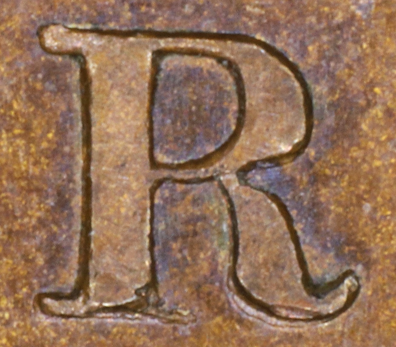
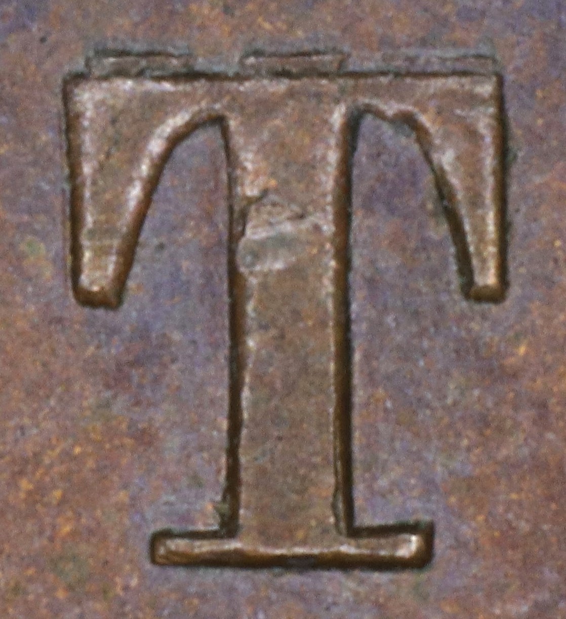
In TOKEN the T is repunched in higher relief over the original letter. Because the new letter was punched lower than the original, the three broken parts of the top of the original letter still show.
In TOKEN the N is repunched in lower relief over the original faulty letter. The upper left serif and right leg top thin serif of the new font show, where those features were missing on the original letter.
3. Reverse R219 Die Clashes, Gouges, and Misc. Feature
Thin vertical die scratch in ONE between center serif and bottom crossbar |